BLOGGER TEMPLATES AND TWITTER BACKGROUNDS »

Our Final Music Video

Our Final Album Cover

Our Final Album Cover

Click on the image to go to The Vixen's Myspace

Thursday, December 17, 2009

Evaluation: Q4

Question 4: How did you use new media technologies in the construction and research, planning and evaluation stages?


Our Edit Suit & Equipment


Reflections

As I was designated the research and planning for this question, I lead it and probably make the most points, however the whole group contributed in this clip to the discussion about the use of new media technologies. We cover all the platforms we used (internet, Premier Pro, Photoshop etc.) and talk about them quite thoroughly, so I would say we've answered this question well.

Evaluation: Q3

Question 3: What have you learned from your audience feedback?


Reflections

We highlight that our audience feedback was very positive, and I am happy that I pointed out the drawbacks of our products (ie. the confusion of the concept and narrative, there should have been more narrative at the end, it was slightly long.)

Evaluation: Q2

Question 2: How effective is the combination of your main product and ancillary texts?


Reflections

Here we discuss (again, quite equally) how we think our texts are actually linked quite well. The main points we highlight are:

  • The fact that we wear the same outfits in our Myspace Banner and on the Alum Cover
  • The graffitied CD background reflects our different personalities, something we use as a theme in the Music Video
  • The colour scheme on the Myspace of pink, yellow, green and blue comes from a still in the Music Video (which is used on the album cover).

Evaluation: Q1

Question 1: In what ways does your media product use, develop or challenge forms and conventions of real media products?


Reflections


I thought this question went well on the whole, and my contribution was fairly equal to the other members of my group. I thought me and Amelia's conversation about the conventions of a music video, and theorists Goodwin and Vernallis, worked particularly well.
I also make it clear (in Part 2 of 1) that I thought we should have made the idea of the 7 Deadly Sins clearer to the audience, which is something I'll still think is a drawback of our video. I'm glad this comes across in the evaluation.

Wednesday, December 16, 2009

Evaluation: Cue-Cards


Amelia made cue cards to help us with the evaluation, and they were very helpful!

Thursday, December 10, 2009

Music Copyright

We attempted to get the rights to use the track from Sony BMG, but they never got back to us. After putting it on youtube, the record label authorised it (an advert for the track on iTunes comes up every time the video is played) so it's all fine.

Monday, December 7, 2009

Evaluation Preparation: Q4

I was in charge of Q4 for our evaluation, so here are my notes:

Technology:

Sony HD DV camera + microphone
-Upgrade from last 'film' project. The high-quality allowed us to explore that glossy element of dance music videos, and worked with all the effects we were using. We needed high quality because on a lot of our shots we had to zoom in.
Mini DV tapes
• Blogger.com
-The easiest, quickest way to record information, photos and plans. We also communicated with each other often on Blogger: if there was a problem, we could tell the gorup via the blog.

Adobe Premiere Pro
-Utilised a lot more tools than last project - used "Image Control" and "Colour Correction" to turn shots black and white, up brightness and contrast on EVERY shot, take out or highten certain colours so all the shots matched. We used "motion" to zoom in and re-frame shots so there was less blank white space in some shots. We also experimented with transitions....We use dissolves as well as jump cuts to mix up pace at corresponding times to the music. We sped up/slowed down/reversed/repeated many shots using the "speed/duration" tool to give the video an "unnatural" and quirky, jumpy feel.

Photoshop
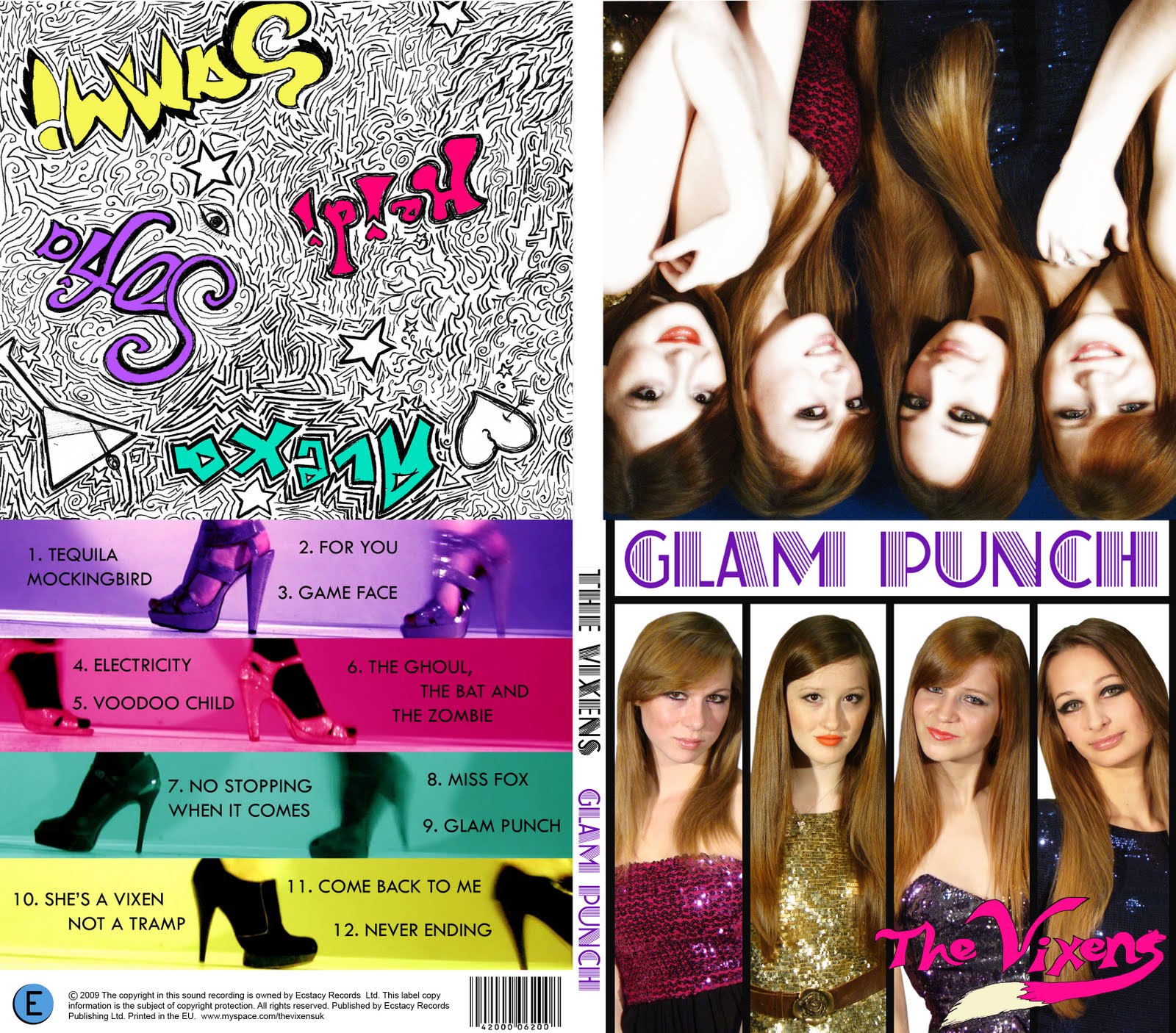
-I drew band name "The Vixens" and graffitied one of the inside faces of the digipack with our band names, and this was scanned into photoshop where we coloured it and outlined everything in black.

Lights (PAG and tall ones)
-Tall lights gave it a glossy look. We needed all the lights in the department because we wanted a very bright video that we could highly contrast in the edit.
- PAG got rid of shadows in bedroom scene, but weren't useful on the day of shoot. also we didn't charge them - wasted time and baggage (something to improve on for next time - always check if we actually need equipment).
-Didn't use Tall lights in bedroom

• Myspace.com
• HTML codes
-Some people in group adapted HTML codes from other Myspaces (tried "Girls Aloud", and "The Electric Flowers") to make our own, which invloved chopping bits out/adding bits in (???) so that we could have a banner featuring our pictures and band name.

• Internet (research)
• Google.com
• Youtube.com
-Audience feedback
-Can see immediately if is successful: are people watching it, rating it, commenting on it?
-Viewed other videos constantly for research and reference for certain shots and styles of editing.


Wednesday, December 2, 2009

Splitting up the Evaluation

Char - Q1 website stuff (sheet), Q2

Amelia - Q3 questionnaire, Q1 music video stuff (goodwin sheet)

Laura - Q1 album cover stuff (sheet), Q2
Holly - Q1 music video (Vernallis sheet), Q4 tech stuff

• Sony HD DV camera + microphone

• Mini DV tapes

• Blogger.com

• Adobe Premiere Pro

• Photoshop

• Lights (PAG and tall ones)

Big lights made more glossy look

PAG got rid of shadows in bedroom scene


• Myspace.com

• HTML codes

• Internet (research)

• HD footage – can zoom in edit as is good quality

• Google.com

• Youtube.com – audience feedback


For photo – camera, tapes, premier pro, lights (studio and pag)

Tuesday, December 1, 2009

Test Screening Feedback

•very professional
•good performance

•good editing

•good colours

•like the jumpiness

•there's a shadow over the last shot, wondered if it could be edited (it can't)

•holly's orange shot has too much contrast

•camera static noise at end needs to be faded down

•love the flashy pokerchip bit

...This is very encouraging!

The Album Cover

We decided that, for the inside face of our digipack, where the CD would sit, we should graffiti our names into a design. We liked this idea because it makes us more relatable and normal, like down-to-earth girls that doodle like everyone else. I was designated the job of drawing the graffiti, and this is what I came up with. I put in little details such as the martini-cocktail glass , stars, an eye and a heart, and made the writing for all our names different in some way, to show our different personalities.